Tom Lincoln
- Mar 1, 2020
- 12 min read
A Young Lion of Design
by Melissa Delzio
“I had a crush on the Jantzen smile girl, Dolores Hawkins,” relates Tom Lincoln with a grin. “One of my first assignments was for Pendleton, to help direct the photography for an ad in front of Robinson’s Department Store in Los Angeles,” Tom recalled. “In the ad, we were using a lamb as a part of the wool story. The photographer brought models from New York City. One of the models was Cheryl Tiegs, who went on to become the most photographed in the world.”
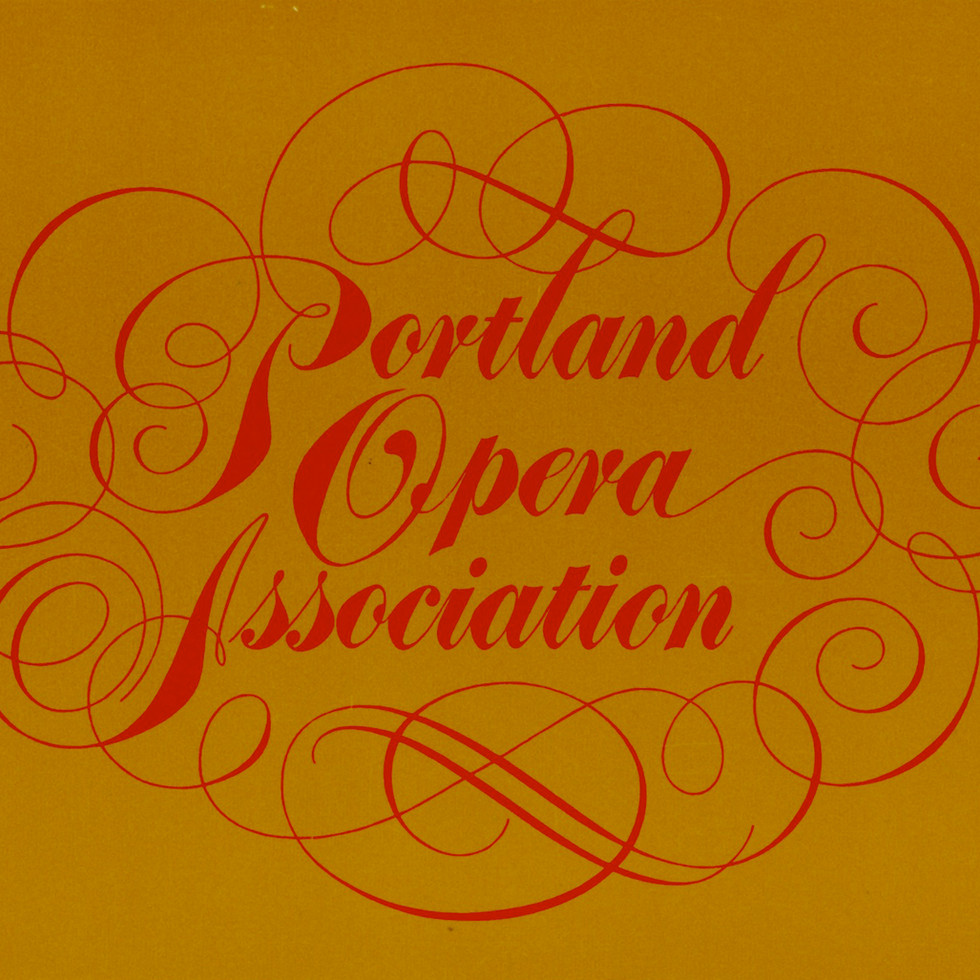
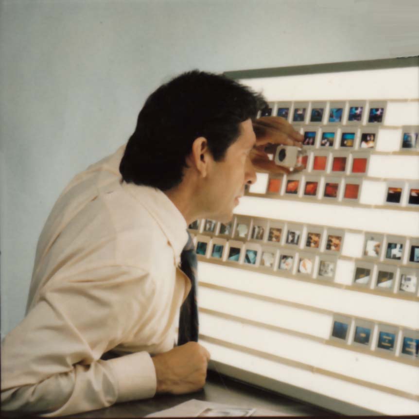
Left to right: Lloyd Center Ad, 1967; Logo for Portland Opera Association; Anheuser-Busch motion graphics storyboards; RCA storyboards; Tom Lincoln in his studio.


Tom Lincoln, now 76, is a man with kind eyes, a quick smile, and big ideas. I met Tom over breakfast (and multiple cups of coffee) in Eugene, Oregon this summer to discuss his Portland beginnings, his influences, and his varied career successes.
What surprised me most about Tom was the grand arc of his career, which took him from the collaborative and supportive environment of Portland, to the “talent talks and bullshit walks” attitude of New York City.
The teachers he studied under, and professionals he worked for, were some of the best in the business, including Lloyd Reynolds and Doug Lynch in Portland, and Herb Lubalin and Milton Glaser in New York. Tom’s professional work ranges from hand logo-type drawing, to advertising, to complex multi-image presentations (a precursor to modern motion graphics). Tom designed best-selling book covers, won awards for his type design that was used by Playboy and Hyatt Hotels and was quoted by Tom Wolfe.
His recipe for success seems to be a persistent drive to create, raw talent, brazenness and a small dose of good fortune. He is the type of guy who loves the nitty gritty details, but can also see the big picture.
Early Influences

Tom was born in Eugene, Oregon in 1939. He grew up on a farm, “hoeing the mint, herding the cows, dodging the rooster, and riding the old mare.”Like many of us, Tom didn’t grow up wanting to be a designer. “I wanted to be a professional baseball pitcher,” he said. It wasn’t until he signed up for David G. Foster’s high school design class that he discovered his calling.
The class was called the Idea Factory, and it encapsulated all things design — from film to screen printing to mechanics. “It was in Foster’s class that I decided that this what I wanted to do,” Tom said. “I learned the love of creating. Every day you wake up and have the opportunity to make something. It keeps you going, you never get bored.” Foster was an intense character. He taught his students the idea that design was about thinking and problem solving.
“We studied the book, Language of Vision by Gyorgy Kepes,” Tom remembered. “He introduced us to point, line, spatial relationships and visual continuity, which is what film is all about. He would bring his own camera, slide projector, film, and printing press to class.”
Foster’s influence went beyond the classroom. “He formed a motorcycle club. A bunch of us rode motorcycles — we didn’t have licenses or anything. We were like The Wild Bunch. We rode over to a quarry of some kind, flipping broadies.”
Foster had said he wanted the parents to feel comfortable, so he would convince them that he was just taking the students to a deserted hill to ride around. To Foster, it was all part of the lesson. “He thought the motorcycle was a perfect design, he had an admiration for mechanics,” Tom said. “He showed the kids that the world was about design.”
The Young Lions of Portland
Ignited by Foster’s lessons, upon graduation Tom Lincoln moved from his hometown to Portland to attend college at the Museum Art School (MAS), now PNCA.
“My first year at MAS was in 1957 when the tuition was maybe, $500,” Tom said. “I paid my way by working as a janitor, cleaning up the studios at night, and as a night watchman in the art museum. The school, at the time, was housed right in the Portland Art Museum. I lived in a three-story Victorian walkup just south of the school. We all smoked back then, Luckys, Camels, etc. We would be sitting in the classrooms smoking, even the teacher.”

At MAS, Tom studied under the famed calligraphy instructor, Lloyd Reynolds. Reynold’s calligraphy program has been cited as a strong influence for Steve Jobs, Sumner Stone (the type director at Adobe) and many other noteworthy artists and poets. Reynolds brought Arnold Bank (Art Director at Time Magazine and a world-class calligrapher) to Portland to teach summer classes at Reed College. Tom took that class.
“It wasn’t until later that I came to realize what a hotbed Portland was for type design,” he said. “All of these people were in Portland in the 60s and later.”Steve Jobs, in his commencement speech at Stanford, said, “Reed College offered perhaps the best calligraphic instruction in the country. Throughout the campus every poster and every label on every drawer was beautifully hand-calligraphed.”In addition to Reynolds, MAS had an all-star line-up of other teachers who Tom studied under. The list included sculptor Manuel Izquierdo, painter Mike Russo, painter Louis Bunce, and designer Doug Lynch, who was Tom’s instructor and later, a friend.

“Doug Lynch was a part of a studio called Artwork Associates, which was located on SW 14th & Salmon,” Tom said. The location was later demolished to make room for a freeway. “He brought me on board as an apprentice to do paste-ups.”
In the 60s, just as today, Portland design agencies would launch and then shutter, with various partners and staff re-shuffling and starting over again. Studio 1030, a shared studio space for freelancers, was the place to be when Artwork Associates closed its doors and Tom Lincoln joined in 1962.
“I rented a desk,” he said. “My only freelance work at the time was doing hand-lettered show cards for the Timberline Bowling Alley in Springfield.”
Luckily for him, studio mates Jack Myers, Joe Erceg, Bennet Norbo, and Chuck Politz had work flowing in. Thanks to the collaborative nature of the creative professionals in Studio 1030, Tom found work and was able to shadow some of the best in the business.
“The older guys would get the assignments and they would have us do paste-ups. I was at an apprentice stage in my life where I would do paste-ups for $10 an hour.”Meanwhile, Doug Lynch became the Art Director at Jantzen when Artwork Associates closed. Lynch soon offered Tom a position with Jantzen and he took it. He worked in the “bullpen” for about three years. Together, the two re-designed the Jantzen logo, based on Tom’s original typography. Later, Doug Lynch commissioned New York-based typographer John Pistilli to use it as a model for a complete Jantzen alphabet.

When Doug Lynch left Jantzen to form Doug Lynch Associates, he again asked Tom to come aboard, this time as a charter member. Together, the two designed the Sallyport, which was (and still is, in digital form) a publication of Reed College.
“The Sallyport had historical significance because of the Vietnam War,” Tom said. “One of the first issues that I did had an article covering a debate between Senator William Proxmire of Wisconsin and Wayne Morse of Oregon about America’s involvement in Vietnam.”


Like many others who worked with Doug, Tom reports that he could be difficult to work with.
“Doug was a very irascible character, a mellow Irishman with a prickly underbelly, like the underbelly of a genius. However, when he really turned on his charm, he was one of the most charismatic people I ever knew. He was a top notch designer, a grueling task master. He was a formative influence for me, but he alienated a lot of people. When I left Doug Lynch Associates, he and I had a falling out, but we mended that after I left Portland for New York City. We maintained a lifelong friendship, and were fishing buddies until the late 90s. In those later years we would discuss philosophical and spiritual matters for hours on end.”
After Tom split with Doug Lynch, he did a stint with Pacific National ad agency and finally, Botsford, Constantine, McCarty.

While Pendleton brought the glamour, the travel and the budgets, Tom remembers designing the Sallyport as more significant.
Now an established designer, Tom Lincoln became President of the The Portland Art Directors Club in 1965. The group was developed out of the yearning of design professionals to give some legitimacy to graphic design.
“We didn’t want to be called commercial artists,” he said. “There was a stigma against commercial art, it wasn’t cool. We wanted to be taken seriously. We were looking to these guys in New York like Herb Lubalin and Paul Rand, or Saul Bass in Los Angeles; they were the trendsetters. We got together to talk shop. We wanted to know what everyone else was billing, to establish norms. Portland in the 60s, was an overgrown hometown, very accessible, not as polished. We were very cocky, I felt like I had the run of the city.”
Chiseled in Lincoln Gothic
In the 60s, you know you’ve hit the big time when the font you designed gets a psychedelic pop culture shout out.
Can you pass the acid test? Comes the call Chiseled on each Prankster eyeball in Lincoln Gothic.
These lines open chapter 18 of Tom Wolfe’s 1968 book, The Electric Kool-Aid Acid Test. If there is any book that epitomizes 60s counterculture, it’s Wolfe’s tale of accompanying Oregon’s own Ken Kesey and his band of “merry pranksters” on their cross country “trip”.
The man behind the typeface Lincoln Gothic, was far from a prankster himself. The font designer did, however, get to meet Tom Wolfe when he was visiting Portland. Per Tom Lincoln’s invitation, Tom Wolfe met he and fellow members of the Portland Art Directors Club for cocktails at The Benson Hotel lounge, where they discussed fonts, and presumably other topics as well.

In addition to earning an oh-so-60s font plug, Tom’s type gained major peer recognition.
“I had entered a national type design competition hosted by Visual Graphics Corporation,” he said. “Lincoln Gothic was one of the finalists. The panel of judges was a who’s who in graphic design and included Paul Rand, Herb Lubalin, and Alvin Eisenman.”
Tom called Lincoln Gothic “a deliberate attempt to interpret the particular characteristics of the Trajan majuscule in a contemporary sans serif face.” The typeface was rendered by hand using pen and ink on illustration board. While Lincoln embraced technology throughout his career, he appreciated the tactile nature of designing with your hands.
“I always felt that those of us in that era had a distinct advantage, even though it was laborious. When I was at Jantzen, I would do comps using a fine brush and tempura paint. We learned patience and devotion it gave us time to appreciate the subtleties of form.”
One joy/fear of designing and publishing a typeface that you have no control over its use.
“The thrill for the type designer is the sudden discovery — in a full page ad, a book jacket, a building facade, on packaging or television — that someone else out there is of like mind,” he said.

Tom’s more recently designed typeface, Roma, was also inspired by his love for the Trajan letterform which was originally instilled in him by Lloyd Reynolds. Reynolds himself was inspired by Father Catich, a leading authority of the Imperial Roman letter. Catich’s studies of the inscriptions on Trajan’s Column in Rome, led him to determine that the serifs were the result of flat brush calligraphy, rather than chiseling techniques, as originally thought. In the 60s, Reynolds invited Catich to lecture at Reed and chisel inscriptions into stone at Eliot Hall. It’s easy to see why, years later, born of Reynolds’s enthusiasm and Catich’s studies, Tom created Roma.
“Roma differs from Lincoln Gothic in one significant way: while the terminals of Lincoln Gothic are flat, in Roma the vertices of letters such as A,M,N,V and Z are pointed,” Tom said. “I believe this change is the critical difference that moves Roma closer to my objective of honoring the original Trajan Inscription. As with Lincoln Gothic, Roma’s strokes have an almost imperceptible entasis that terminate in a subtle flare; a vestige of the serif. The importance of this feature is that it imbues the font with a humanist quality. The serif, as Father Catich points out in his book, The Origin of The Serif, almost certainly derives from a combination of the flat brush and the human hand; it is what ties the letterform directly to human anatomy and craftsmanship, integrating it in a fundamental way with the nature of man — as distinct from the machine.”

Going Electric in NYC
To Tom, New York City always had an allure. “I had visited New York when I worked for Jantzen because they had a suite of rooms on Park Avenue,” he said. “I was fascinated by it, I knew I would move there when the time was right. In 1969, when Botsford, Constantine, McCarty folded their Portland office, the time was right to move to New York. I had $500 in my pocket. I got a hotel room at the Pickwick Arms Hotel. You could get a hotel room for $60 a week back then. I scored a job with Herb Lubalin before my money ran out, it was a hail mary pass. I got the job with Lubalin frankly because most of his staff was on vacation. He said to me after he looked at my book, ‘We need some bodies around here; can you start tomorrow?’”
When Herb Lubalin’s regular staff began returning, Herb recommended Tom for the position of Assistant Art Director on a multi-media project being produced for IBM. Tom had never done any audio-visual work, but because David Foster had taught him visual continuity and film, and other such experiments, he was able to pick it up.
“My heart was in my throat when I was working on this IBM project. Everything happened so fast, budgets were staggering. I was working with people that included Carole Hart, who won an Emmy for her role in developing Sesame Street, and Jim Henson who did puppets on the project. The atmosphere was electric.”
Tom wrote an essay the first year he was in New York about the energy that surges through the city. “It just picks you up like a flood and carries you with it. You hit the ground running and you don’t dare stop running or you’ll get paved over.” The IBM project lasted two years before Tom was able to start his own New York studio, Lincoln Associates.

In New York City, home of numerous publishing houses, book jacket design was often a designer’s bread and butter. “When I was at Lubalin, I did book jacket comps and became familiar with New York’s many publishers,” Tom said. “These were some of my favorite assignments. A book’s compact size affords the opportunity to treat each cover as a miniature poster.”

When Tom started Lincoln Associates, he routinely called on publishers. One of his most successful covers was Betty Crocker’s Cookbook, which at one point had the second largest circulation in the world next to the Bible. Referred to as the “Red Pie” Cookbook, it was a standard in American kitchens in the 70s and probably one of the most recognizable cookbooks besides The Joy of Cooking.
By the late 70s, the fields of advertising and design were changing fast with new technologies, and Tom was at the forefront of the changes. With the work for IBM under his belt, he accumulated more and more multi-media work.
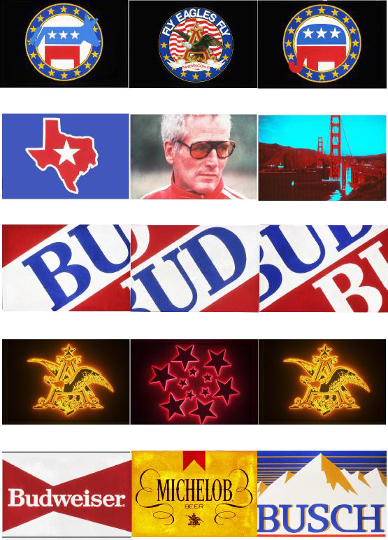
“I began doing so much audio visual work, I changed the name of my business to Motion Graphics Communications. I would create elaborate presentations. Typically I would design for a three-screen format with a bank of 36 slide projectors that were computer driven and in-sync with each other. I would get a script and I would put together a storyboard for the script and produce the graphics. I did shows for Anheuser-Busch, RCA, IBM and AT&T.”

Tom describes a practice of multi-image, where 35mm slides were projected by multiple projectors onto multiple screens so the images would blend, cut, dissolve and create animation. In addition, the presentations would sync with audio. Tom’s storyboards give some idea of the complexity and creativity this new medium allowed.


In New York, Tom had many studio spaces, staying one jump ahead of rent hikes. One was in the heart of Times Square, “where you had to walk through all kinds of sleaze.” Another was at 207 E 32nd which was (and still is) the building Milton Glaser owns. Glaser occupied the ground floor, Tom had the fourth floor in the space where New York Magazine was launched.
In later years, while on vacation from his job as Art Director, he took Milton Glaser’s intensive design course at The School of Visual Arts.
“Glaser’s prime influence on me was his emphasis on concept,” Tom said. “He frequently uses surrealism in his illustrations to create surprise or a spark of some kind by merging two ideas.”
For a decade, Tom absorbed everything New York had to offer, and found inspiration everywhere, especially underground. “I became interested in the letterforms of the subway system, which were tiles. I covered every mile of the system, getting out at the stops and doing rubbings at each stop. I wrote a book called, The Underground Art of the New York Subway. I never did promote it enough to get it published, but I developed a font out it (called Subway Gothic) and used it for a logo.”
Even in the urban jungle of New York City, Tom’s love of letterforms, instilled in him by his Portland teachers, shined through.

Building Arches
“Every day you wake up and have the opportunity to make something,” Tom told me. To him, that sentiment still applies just as much today as it did then. Now, having moved back to his Oregon home, Tom and a few friends are together spearheading the creation of a large revival landmark in his hometown, The Springfield Gateway Arch. A kickstarter campaign helped fund the creation of a detailed 6ft wide model of the arch, and additional fundraising is underway to make the landmark a reality. Tom hopes to one day pass the arch on the way to one of his favorite fishing holes. After all that Oregon gave to him, this project seems to be a way to give back.
At 76, Tom doesn’t appear to be slowing down. He is proud of his career achievements, yet warm and full of good humor. Over breakfast, when a waitress interrupted a story of his, he jabbed, “I’m bragging about myself here…don’t interrupt” and gave a hearty laugh. As our visit came to a close, he remarked, “You’re like me, you’re not content just being a designer. You want to turn every rock over to see what’s under it.”
Maybe so, and I think that might not be such a bad way to be.
Big thank you to Kenneth O’Connell who joined us for breakfast and told many amazing stories about David G. Foster. Kenneth wrote a book about Foster called 99 Gold Stars. This article originally appeared here.
If you have more to add to this entry, or a recommendation on who we should feature on Portland Design History, please reach out to: melissa@meldel.com.
Documents


Comments