Jantzen
- Apr 7, 2020
- 9 min read
Updated: Apr 13, 2020
Collaboration Between Design & Advertising in the Jantzen Bullpen
By Trudy Chin
Written as a part of the Portland Design History Class at PSU

For those who wore Jantzen in the 1960s and 70s, the essence of carefree living was easy to obtain. In catalogs and advertisements, beautiful models and hunky professional athletes were seen living life like everyday people. The ads were funny and cheeky. Models were on the beach, all with a sense of ease, goofing off and blissfully lounging in the sun. And they looked good in what they wore. This imagery sparked a desire in the modern American to live in this carefree lifestyle too. The visual and emotional creativity that stemmed from these ads was a result of the collaboration between design and advertising from Jantzen’s local Portland talent.
Portland Knitting Company
The history of Jantzen begins with the history of swimwear. John A. Zehntbauer, Carl C. Jantzen, and C.R. Zehntbauer founded the Portland Knitting Company in 1910, with a few knitting machines above a tiny retail store in Portland, Oregon. They made wool sweaters, gloves, hosiery, and various other knit woolen goods. They were focused on warm wool sweaters, until 1913, when a member of the Portland Rowing Club came into the store. He asked the company to make a pair of rib-stitch rowing trunks, much like the stitch used for sweater cuffs. He wanted a bathing suit that would stay up without a drawstring and that was fit for cold morning paddling on the Willamette River. The company came up with the first elastic-waist garment which weighed eight pounds when wet.
Soon after, the Portland Knitting Company transitioned to the shorter name of Jantzen. They began making and selling 100% pure virgin wool bathing suits that were lightweight and accompanied by a matching cap and stockings. This bathing attire became popular and was a great turning point for the company.
Jantzen began advertising these “bathing suits” up until 1921, when they introduced the name, “swimming suit.” This was a new term that hadn’t been used before in advertising. “Swimming suit” was implemented in all advertising copy from there on out. The language of the advertisements highlighted the suit’s ideal use. They showed they were fit for swimming, and elevated the athletic reputation of Jantzen. Early advertisements guaranteed the famous rib-stretch would “give that wonderful fit”. Jantzen’s first slogan for the swimming suit advertising campaign was, “The suit that changed bathing to swimming” and was shown alongside the iconic Red Diving Girl logo.
Who is the Red Diving Girl?
The Red Diving Girl first appeared in Jantzen catalogs, sporting her own red swimming suit, cap, and stockings. The logo was designed by Frank and Florenz Clark, who were freelance artists from Seattle working with Jantzen’s advertising agency. In the months after, billboard advertisements appeared with the Red Diving Girl. Bumper stickers with her iconic diving posture started popping up on cars, causing heads to turn and crashes to ensue. (These stickers were deemed too distracting and were banned in the interest of safety in Boston in 1924.) The Red Diving Girl became one of the longest-lived apparel icons in advertising history.
Jantzen’s first national advertisements were published for swimming suits as full color ads in Vogue and Life magazines, with illustrations of swimmers and beach-goers in Jantzen suits.
The innovation shown throughout Jantzen’s advertisements in the 1920s set a bar for the advertisements that would follow. Jantzen produced ads with “pin-up” style art and illustrations, featuring attention-grabbing swimsuits that showed the person’s shape and figure of their body.
Copy tended to lean towards the cheekier side, including “Come on, get down to bare essentials… the wonderful bare essentials of the new Jantzens.” These themes within advertisements became the central messaging for Jantzen. The main idea was: if you’re wearing a Jantzen, you look good and others think so too. It was that kind of message and style that stayed with Jantzen through the 1960s and 1970s. The ads held an elevated quality which was eye-catching and desirable for the modern American searching for comfort and performance, as well as fashion when it came to sportswear. Especially for women. Because of these ads, women were welcomed within the swimwear world.
While many campaigns were produced by big New York agencies, in Portland, the brand hired top local talent in-house and used many local freelance artists, designers, and creatives who worked to improve the Jantzen brand identity. However, many of these early-day “pin-up” style ads had a heavy use of airbrush painting styles, perpetrating unrealistic idealized views of a woman’s body, and featured romanticized images of saturated Americana lifestyles. These ads excluded people of color and didn’t show lifestyles that differed from the classic American Dream. As we look at these ads today, we can see how problematic they are in terms of inclusion. In the 1920s, this style of advertisements is what was commonly seen throughout media and entertainment, which is probably why these ads hold a sense of nostalgia to them.

Jantzen’s 1960s Design: Thomas Lincoln
Throughout the 20th century, there were many prominent creatives at Jantzen. These were the people who were making big changes in the sportswear industry of the Pacific Northwest. Collaboration fueled innovation and talent sparked beautiful outcomes.
Out of hundreds of people who had worked at Jantzen in the 1960s, I had the chance to hear about the experiences of Thomas Lincoln, a designer from Eugene, Oregon. While he only worked at Jantzen for a few years, his memories of his experience are fond. Jantzen was his first secure job since the army. Previously, he’d had smaller jobs at Studio 1030, an influential design studio in Portland from the early 1960s. The studio was a shared office space for freelance designers who would sell themselves as a team for jobs.
Lincoln was hired on at Jantzen by then Art Director, Douglas Lynch, who was a prominent designer in Portland at the time. Lincoln had studied under Lynch while attending The Museum Art School (now known as PNCA). “I can still envision entering the office at 18th & Glisan,” Lincoln recalls of when he first started, “…walking past a sea of desks and secretaries on the first floor and up to the second floor to the advertising and sales promotion department where I occupied a drawing board in the ‘bullpen’.” The job he had was not a salary job, but instead was more like an in-resident freelance position. It was full-time, and pay was enough for him to replace his 1956 Ford Fairlane convertible with a sporty, robin’s egg blue 1962 MG Roadster. Disclaimer: this was back when filling the tank only cost about $15.


Thomas Lincoln working on the rendering of the new Jantzen logo.
Within the advertising and sales promotion department, there were a number of various administrators, executives and secretaries, but Lincoln worked closely with the more creative types. Some of these colleagues include Lynch; Bruce Sturm, the head of the department; Sam Nichols, an illustrator and art director; Ray Olson, a former Museum Art School classmate to Lincoln; as well as other illustrators and designers. Their projects included work for catalogs, advertisements, special promotions, hang tags, booklets, displays, and the redesign of the Jantzen logo.
Throughout the years, the Red Diving Girl went through a few subtle changes. The wordmark for the Jantzen logotype was set in the already established and readily available font, Bodoni Bold. After 40 years, it was decided that Jantzen needed a fresh new look. The redesign was headed by Lynch and Lincoln, beginning with Lincoln’s rendering of the word “Jantzen” in a style which mimicked something like a Bodoni Condensed, if there had been a condensed form of the font.
However, there was no existing font like this. “There was a font around the time called Torino Roman that came close, but it was a little too delicate,” Lincoln remembers. And so, Lincoln set out, under Lynch’s direction, to create a new prototype. This new rendering was sent to a well-known type designer in New York by the name of John Pistilli, who was tasked with creating an entire Jantzen alphabet in the new design. The font was sent back to Portland to be copied using a photostat machine (similar to an early day photocopier). After they were copied, the letters could be cut up and assembled on new layouts. Designers like Lynch and Lincoln were able to use the new Jantzen font when assembling advertisements headlines and various other Jantzen collateral.
Lincoln worked at Jantzen from 1963-1965. As he was going through memories of his tenure, he recalls going out for burgers at Yaw’s Drive-In Restaurant up the street. “Still the best I ever tasted,” he says. He once played (brilliantly, according to reviews) on the company softball team, which scored him a feature in Jantzen Yarns, the company newsletter. After the Yarns article was printed, he remembers, “I walked on air for a full week following that.” He once was invited to accompany the crew for a photoshoot at Timberline Lodge, promoting the Jantzen Winter Collection. The shoot featured the very glamorous, official Jantzen Smile Girl, Delores Hawkins. Lincoln recalls being quite in awe of her, given that he was a single guy in his early twenties and all.


Jantzen ad from "Jantzen Armed Services department. Design by Byron Ferris. Writing by Homer Groening.
Jantzen’s Late 1960s–1970s Advertising: Roger Yost
I had the opportunity to talk to former Jantzen Art Director and Advertising and Marketing Manager, Roger Yost. While he now is the proud owner of an art gallery on the Oregon Coast, Yost was once the man behind the advertisement campaigns that led the Jantzen brand to the top of all sportswear companies of the time.
Yost is originally from the Midwest and had previously worked for ad agency, J. Walter Thompson (JWT). He had once visited Portland to present to Jantzen management on how JWT could assist with advertising and PR support for Jantzen. The Jantzen Men’s and Women’s Divisions had recently gone through a split. Management had been so impressed with his presentation, that they offered him a job out in Portland. “I didn’t get the business for JWT. What I did get was an offer to join the Men’s Division as its Advertising and Marketing Manager!” Soon after, Yost was on his way west.
During his first two years at Jantzen, Yost had worked alongside the influential Portland designer, Byron Ferris and copywriter, Homer Groening. It was 1967 and Jantzen had just became the NFL’s first apparel licensee. Today, that license is held by Nike. The new advertising campaign implemented an innovative technique called sports marketing, which was spearheaded by Jantzen. This was the first time advertisements used iconic and famous athletes to sell products. Through the work of Yost, Ferris, and Groening, athletes were seen throughout ads, influencing those shopping for Jantzen sportswear.


A collection of pages from Jantzen annual reports from the 1950-1970s.
These prominent sports marketing ads featured the Jantzen International Sports Club. This club included famous pro-athletes, such as Frank Gillford, Jerry West, Paul Hornung, and other athletes of the time. The ads presented the athletes wearing Jantzen sweaters, swimwear, and leisurewear, highlighting the durability and comfort of Jantzen apparel. They all look pretty cool wearing everyday clothes like you and I would!
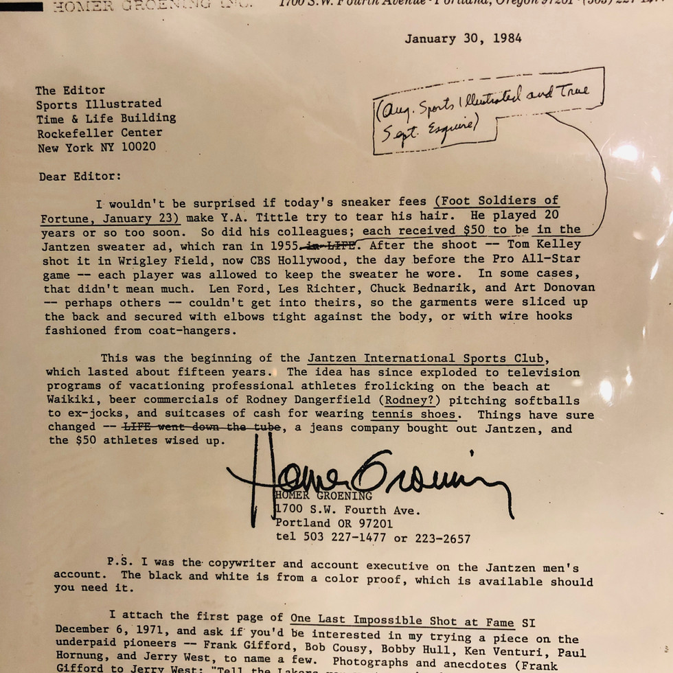
In a letter written by Groening to the editor of Sports Illustrated, he states that the athletes who participated in the ad’s photoshoot “each received $50 to be in the Jantzen sweater ad... [and] each player was allowed to keep the sweater he wore.” Today, athletes endorsing a brand would be paid millions. They probably get to keep any clothes they wear for the ad, too.


Advertisements made with the Jantzen International Sports Club. Byron Ferris, Homer Groening. Around 1966. Homer Groening's letter to Sports Illustrated.
Further along in the 1970s, the Yost, Ferris, and Groening team also produced a biopic series on model athletes. Yost recalls, “…we worked with Homer Groening to create a 30-minute television show… I then syndicated to more than 120 TV stations. In return we received four free 30-second spots and opening and closing sponsor credits.” Because of this short documentary series, Jantzen was able to reach wider audiences. In turn, this allowed them to beat out competitors in the sportswear industry. This also expanded the growing men’s apparel department.


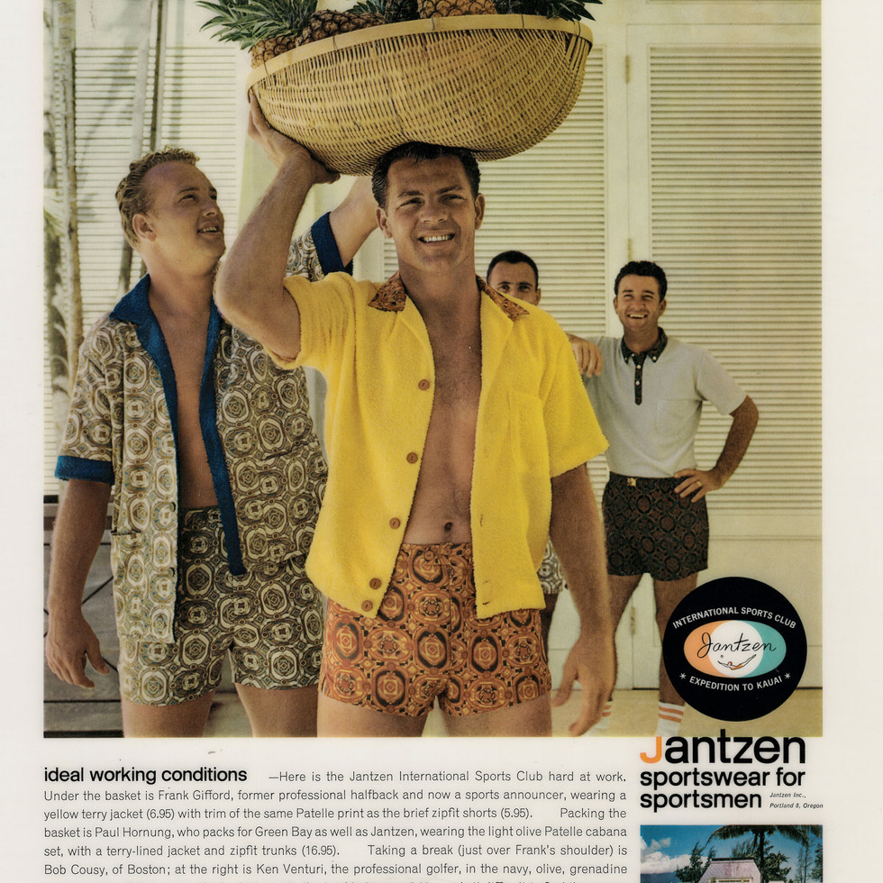


Advertisements made with the Jantzen International Sports Club. Byron Ferris, Homer Groening, Roger Yost. Around 1966.
For Yost, working at Jantzen was an opportunity that opened up his creativity. He was able to use his creative skills in many forms and mediums. He not only worked with print advertisements and catalogs, but also created pieces for radio and dipped into filmmaking as well. He remembers Portland beginning to open up and develop its own kind of creative style, something that was forever growing into something new.
Where is Jantzen Now?
Jantzen swimsuits changed bathing suits to swimming suits, defining swimming as a sport for women as well. These suits were not only practical, but they were known to be flattering and fashionable for women. Jantzen swimsuits could be seen on every beach and in every pool. At the height of Jantzen’s popularity and success, monuments of the iconic Red Diving Girl were made. A series of 20-foot-tall fiberglass and steel statues were put up in locations all around the country. One had a short lifespan at Portland’s American Advertising Museum (AAM), that Yost, Ferris, and Groening had started after their time at Jantzen. The Red Diving Girl was donated to the AAM by Yost, however she did not survive there long as the museum closed in 2004. One Diving Girl is still known to live outside of a swimwear shop in Daytona Beach, Florida, where she was installed in the 1960s. She is still suspended in her classic mid-air diving position today and is loved by beach-goers and tourists. The Red Diving Girl became an icon of the success of the brand. She, and the nostalgia she holds, are cherished and beloved by many.
In 1980, Jantzen was purchased by Blue Bell, a company that was better known for its denim production. Jantzen was then bought by Miami-based clothing company, Perry Ellis International in 2002. For a few years after that, the headquarters remained in Portland, with an office that employed designers, sewers, quality control personnel, product coordinators, and archivists. The archives were located in the original headquarters building, however, after nearly 90 years of calling Portland home, Jantzen headquarters and archive has moved to California. The building that was once the Jantzen headquarters in Portland is still standing in Northeast Portland, just off of Sandy Boulevard. And just above the main entrance, a tiny Red Diving Girl resides, a small nod to the innovation and creativity that once took place just behind the front doors. •


Comments